PM3 App Redesign
Branding | Visual Design | UI/UX
PM3 is an iOS app designed to tackle health equity concerns surrounding maternal morbidity of Black women.
The app is part of a long-term research project in the Wellness Technology Lab at Georgia Tech.
The app is part of a long-term research project in the Wellness Technology Lab at Georgia Tech.
Tools Used
Figma, FigJam, Adobe Illustrator, Adobe Photoshop
Goals
- Reimagine the UX and user flow centering ease of access for the target audience: Black women in rural Georgia aged 18-45.
- Create visual designs consistent with branding guidelines and pre-determined design system.
- Implement all features and UI elements required to run the research study.
Challenges
- Developer Capacity:
The project only had one iOS developer, still in training. We needed to make trade-offs to feasibly have our designs developed, which meant sacrificing complex UI and interactions for more functional, basic elements. - Time Constraints:
The app needed to go into production in less than a month. With only two designers on the team, we had to make tradeoffs on design decisions for the first launch and table deprioritized designs for the next iteration. - Conflicting Stakeholder Priorities:
This project involved multiple stakeholders including researchers, clinicians, sociologists and community leaders from Georgia Tech, Emory University and Morehouse School of Medicine. Because of the diverse backgrounds and perspectives of the stakeholders, each person had a different priority. Conflicts arose in visual design choices and branding decisions.
Throughout this case study, I demonstrate how I addressed each challenge in collaboration with my team.
Impact
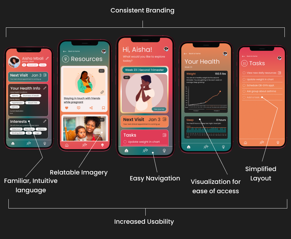
Our redesign resulted in a Net Promoter Score (NPS) of 4.2/5 from previously 2.3/5 NPS.
Before
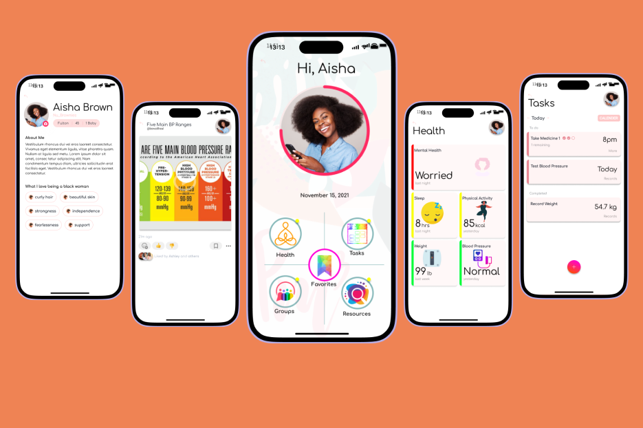
After
DESIGN PROCESS
Stage 1
User Research
When I onboarded, the project already had an app in testing. Additionally, ongoing focus group discussions were being conducted to collect user feedback and accomplish user testing. A total of 12 focus group discussions with 82 participants were used to gather research data.
My co-designer and I, along with the HCI researchers on the team used Affinity Diagramming to analyze the collected data from users.
My co-designer and I, along with the HCI researchers on the team used Affinity Diagramming to analyze the collected data from users.
Research Findings
User Quotes regarding the old app from focus groups
"I don't understand where to go from the homepage. Too many things everywhere.. very hard to start using the app."
"Can't really find what I am looking for"
"The images are a little cheesy"
"The buttons don't do what they are supposed to be doing. It's a lot of effort to do what I'm trying to do."
Affinity Diagramming
To interpret the data from the 12 focus group discussions, I led an Affinity Mapping workshop with the other designer, team researchers and the developer. Because our team was spread across several locations, we conducted a virtual workshop using FigJam.
We defined four clear design implications from the Affinity Map, and I started wireframing the new interface design.
For each focus group, we identified quotes relevant to the user experience of the mobile application in three 20-minute brainstorming sessions. Below is the diagramming portion for quotes from the first group discussion's transcript. To avoid redundancy and maximize efficiency, I encouraged team members to limit the number of quotes to only as many as could fit in the FigJam box of sticky notes.
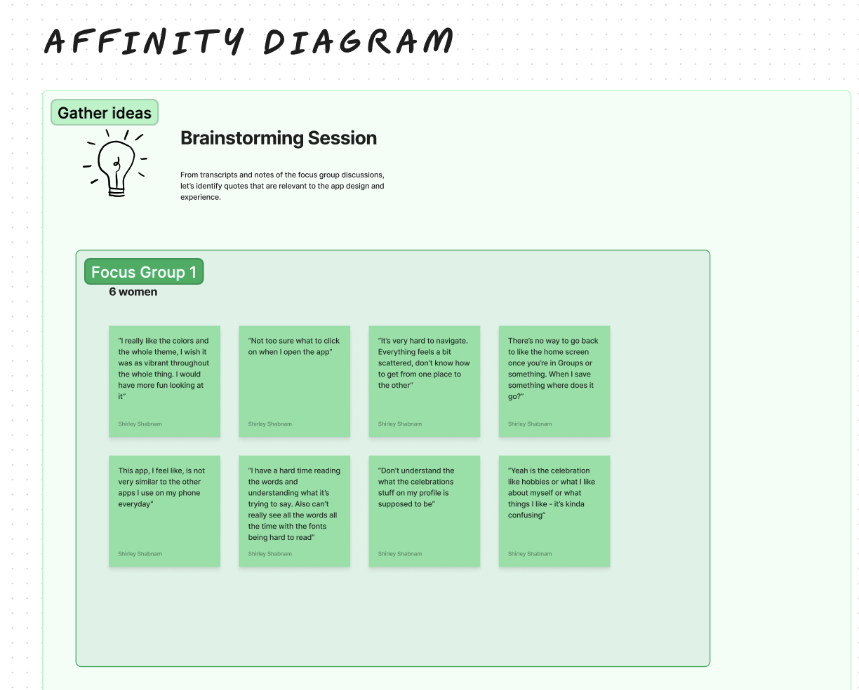
Afterwards, I led our team to move into organizing the ideas and interpreting them as design implications. We dragged our sticky notes into categories based on our initial personal perceptions. I facilitated discussions to find common ground when there were differences of opinion. In my role as the workshop facilitator, I ensured that all team members' inputs were heard and taken into consideration when reaching a decision.
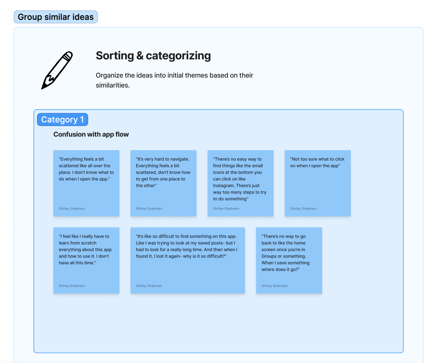
I noticed that we were initially having challenges with naming the categories. For the first theme, we went over time trying to decide on a name. I intervened and encouraged that we use rough titles for categories and modify them in the next stage collaboratively.
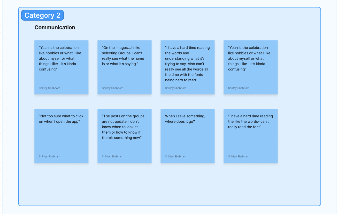
Throughout the categorization phase of the Affinity Mapping process, I reminded my collaborators that this is an iterative approach. We cannot achieve satisfactory design directions in the first run. My team members felt more at ease in expressing their honest opinions and ideas more genuinely after this reminder.

For the next phase, we revisited our initial categories and have a deeper, more interpretive discussion on what the themes imply for the app design. We all took 10 minutes to comment our interpretive thoughts on the FigJam document. We also referred to the design interfaces in question and discussed specific areas to implement these changes.
When we were done, we moved on to creating more well-defined themes with concrete design implications. The initial categories seemed to be isolated from each other. We conversed about how they are connected to have a holistic approach for the redesign.
When we were done, we moved on to creating more well-defined themes with concrete design implications. The initial categories seemed to be isolated from each other. We conversed about how they are connected to have a holistic approach for the redesign.

Finally, we summarized our key findings and next steps for the design process.
We found that users did not feel a connection with the branding and visual design elements representing the brand values. They felt it was misaligned with how they were hoping the app to look and feel. User research also implied that they was a gap in feeling a sense of community and sisterhood, which was an important brand value we were trying to uphold throughout the interface and user experience.
The interface did not perform well on usability tests. The app was not accessible to our target audience, especially in terms of readability. With support from my co-designer and the research team, I ensured that our design process centered accessibility moving forward rather than having it as an afterthought.
After several iterations, we decided on four clear themes to guide our designs:
- Usability
We want to improve user experience by ensuring that our app flow and UI is accessible to the user base. This meant that we needed to understand our users better. We needed to know deeply what the users' needs, limitations and pain points were. We found it important to create a sense of familiarity to remove fear and intimidation. Based on an understanding of the users abilities and access, we would make informed design decisions.
Apart from user-centered design, we would follow web content accessibility guidelines to anchor our designs and expand access to as many people as possible. We decided to also provide introductory instructions when a user first starts using the app. - Visual Consistency
To ensure that the user experience reflects our brand values and guidelines, we will pay careful attention to visual elements. We will take a holistic approach to visual design. I proposed that we revisit the design system to ensure that it is accurately representing the brand values and is appropriately updated for consistency. - Meaningful Representation
To ensure that users felt an authentic emotional connection to the socio-technical aspect, imagery, visual UI components and the overall feel of the app, we needed to cater directly to the audience's sense of belonging. This meant conducting further investigation into psychological factors, equity and our target demographic. - Community
Users felt disconnected from their peers and other members of the community when using the social features of the app. One of our goals would be to foster a sense of connection with others. To figure out the best way to enact this, we looked further into existing HCI research and guiding theories surrounding marginalized communities, equity and inclusive healthcare practices in technological interventions.
To summarize, all four of our guiding themes for design change centered evoking a sense of familiarity, ease and safety. We moved on to brainstorming how these themes manifest in action through Wireframing.
At the same time, we looked into opportunities to conduct further research. I reached out to the research team to find if there was exisiting research on user needs that we can refer to. As this was a long-term project spanning several years, we were able to find the core research during the initial stages of this project.
At the same time, we looked into opportunities to conduct further research. I reached out to the research team to find if there was exisiting research on user needs that we can refer to. As this was a long-term project spanning several years, we were able to find the core research during the initial stages of this project.
Stage 2
Wireframing
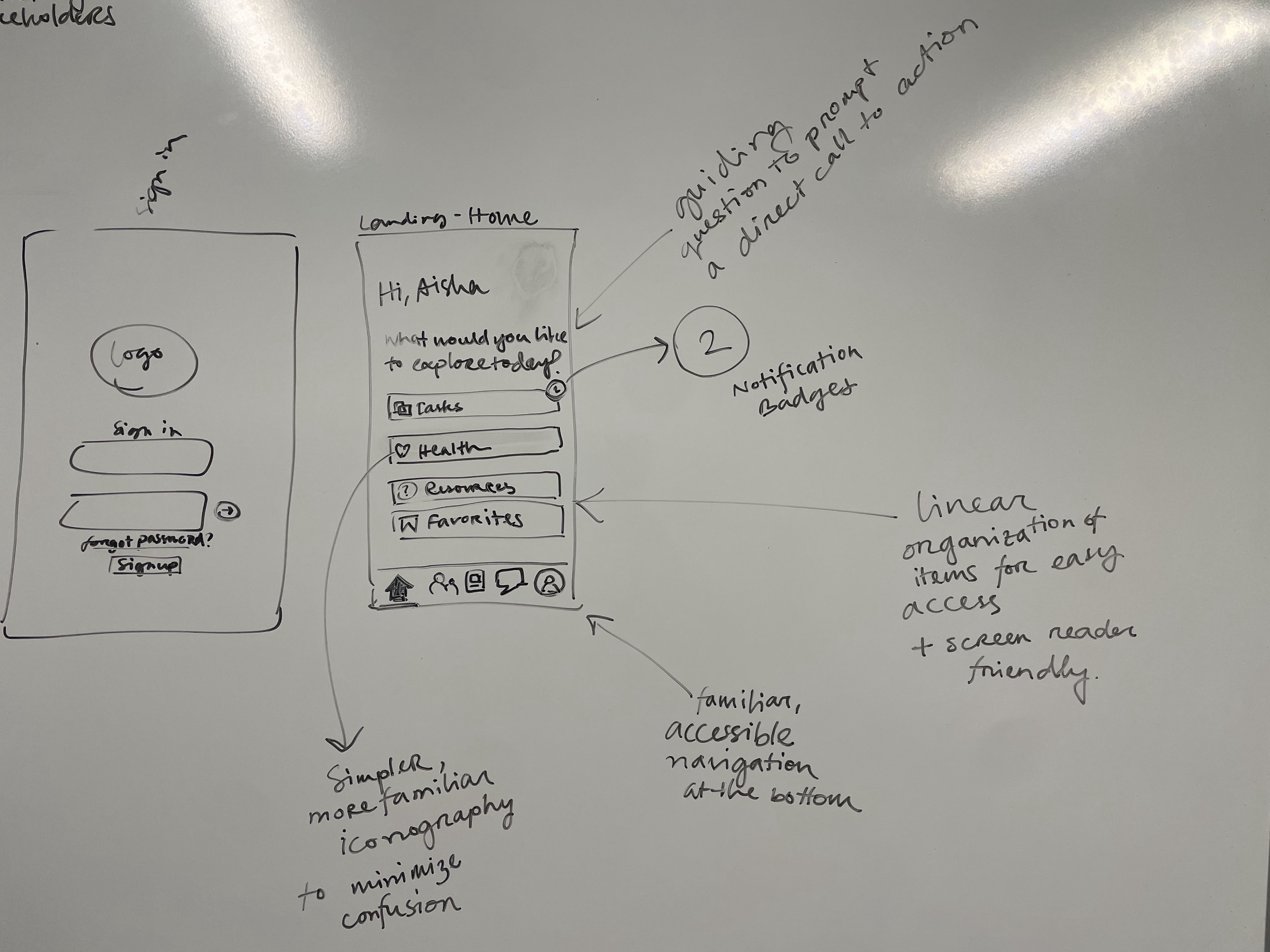
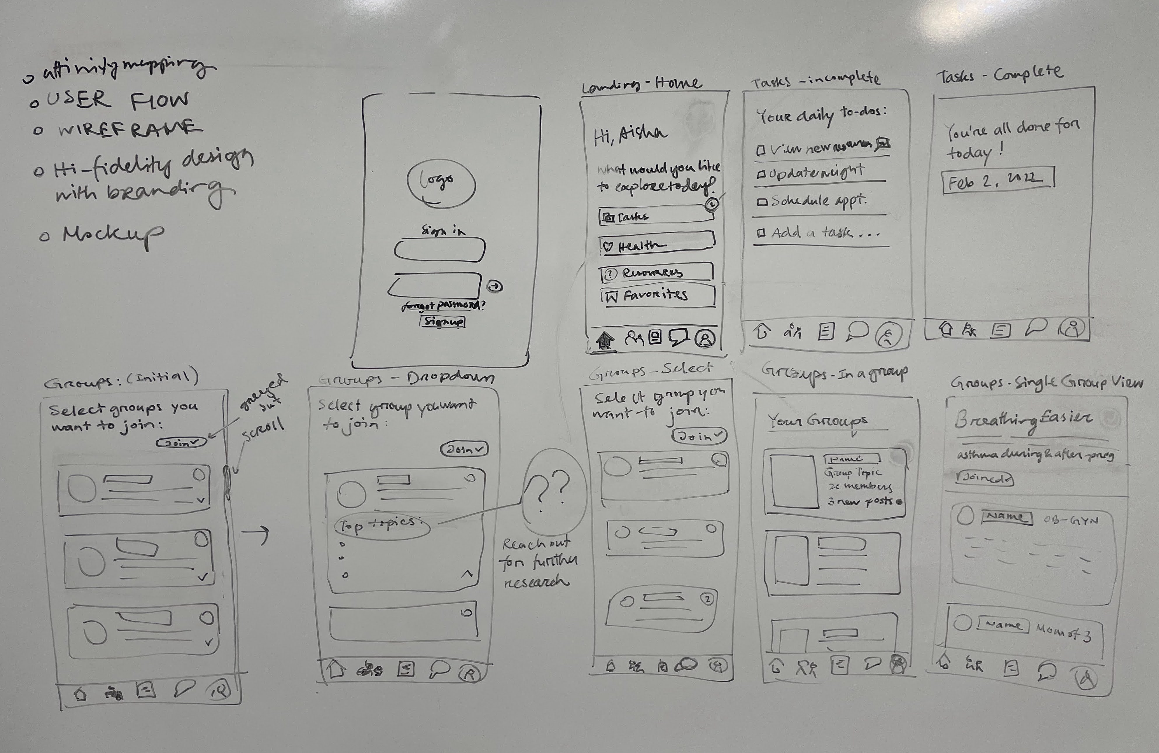
Rough initial sketches focusing on the pain points and key themes for the redesign
Stage 3
Visual Brand Identity
Design System
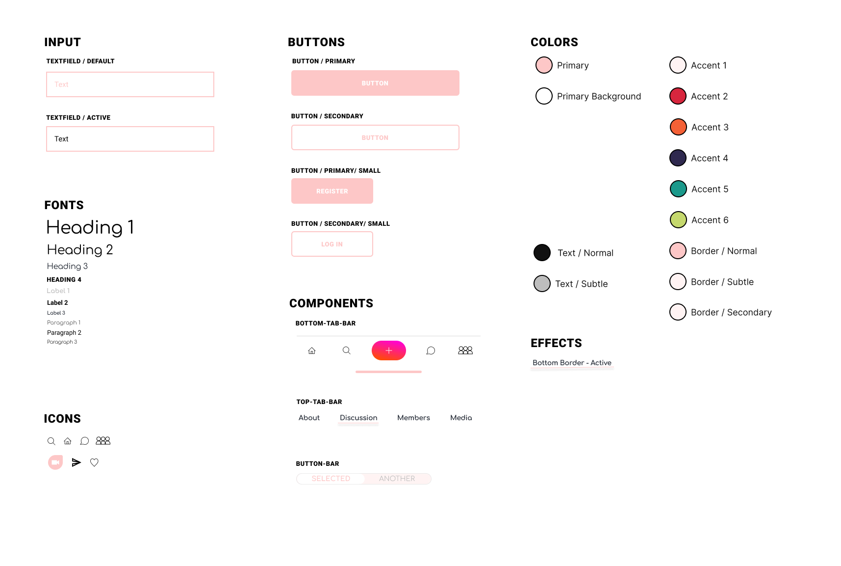
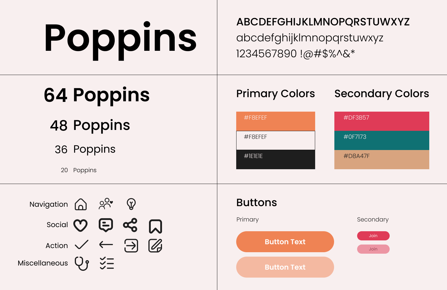
The research team provided us with the core bran values: community, sisterhood, femininity, and strength. My co-designer and I met with te researchers and community leaders to identify which components of the existing design system were important to keep. The color palette resonated strongly with the users, so we stuck to the original colors. I proposed a new design system to simplify our UI to evoke a sense of familiarity and femininity while still holding onto strength through the bold icons.
Below is the the design system we started with:
Below is the the design system we started with:
Rebranding:
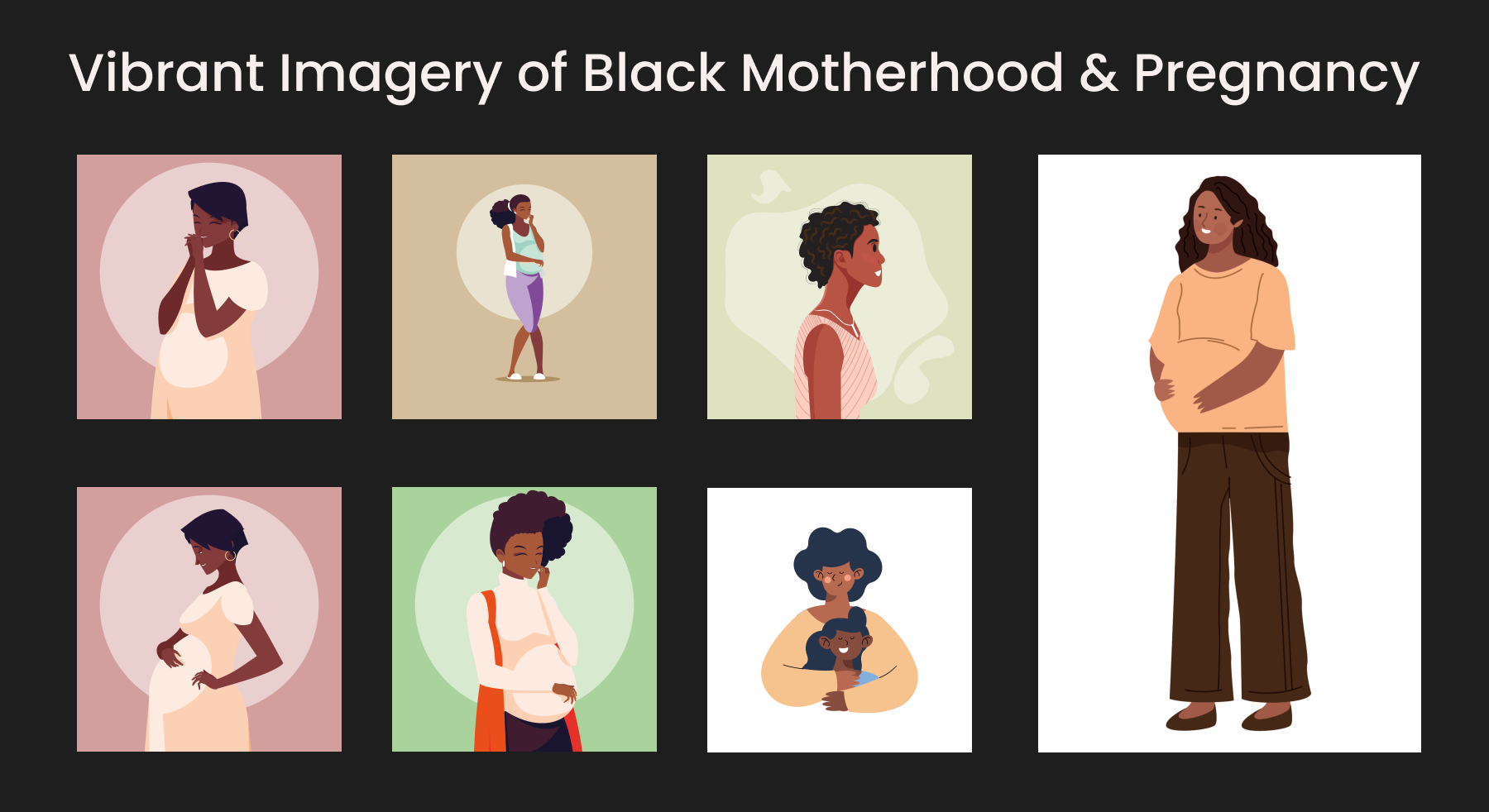
At this stage, we faced challenges surrounding conflicting stakeholder priorities. Although the researchers, clinicians, community members and other stakeholders agreed on the brand values, there remained a conflict of visual identity. Because of the time constraints for the first launch, I pushed for an urgent meeting to navigate this conflict. I facilitated the meeting to collaboratively decide on a visual identity using a conflict mediation approach. I ensured all members were heard, but I intervened to provide insight from a designer's perspective to provide maximum value for the users.
I drew references to the user research, and opinions about imagery. We decided that it is in our best interest to cater to a wide audience by choosing more neutral visuals.
I drew references to the user research, and opinions about imagery. We decided that it is in our best interest to cater to a wide audience by choosing more neutral visuals.
Stage 4
High-Fidelity UI Designs
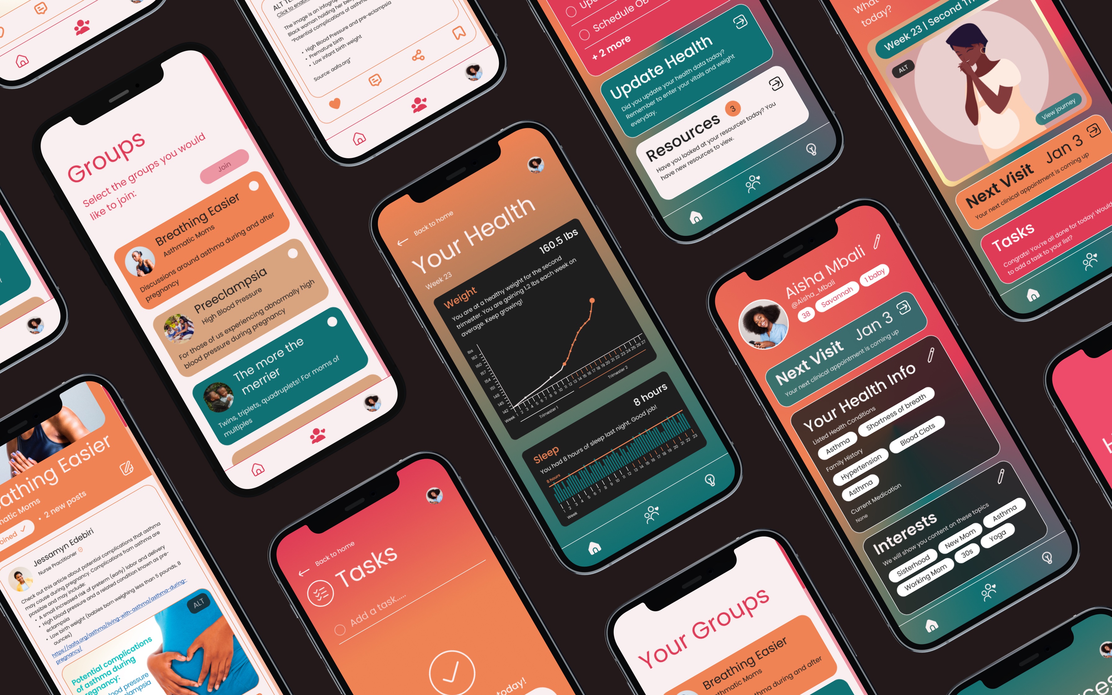
We took an iterative approach to our UI Design process. We learned that we only had one iOS developer on our team. This presented a unique challenge to us in addition to the time constraint. We had limited capacity and limited time to decide the best path forward.
Our initial designs were much more complex and involved many interactive elements. When presented with the limitations moving into development, we made decisions for trade-offs. The design and development team did not have a project management approach in place before I joined. At this stage, I proposed to incorporate components of Agile Methodology to ensure the best product for the first launch. I suggested we use the Scrum Framework and focus on the First Sprint Cycle.
In collaboration with the developer and lead researcher, we conducted a Value vs. Complexity analysis. Our goal was to provide the most value for our users in consideration with our developer's capacity. We asked the developer for a realistic estimate of the complexity the app could have.
Based on this complexity estimate, we discussed potential UI elements, features and interactions to be modified or tabled for a later launch.
The PM3 app is currently set to begin its sixth sprint cycle after completion of current User Testing.
View PM3 WebsiteOur initial designs were much more complex and involved many interactive elements. When presented with the limitations moving into development, we made decisions for trade-offs. The design and development team did not have a project management approach in place before I joined. At this stage, I proposed to incorporate components of Agile Methodology to ensure the best product for the first launch. I suggested we use the Scrum Framework and focus on the First Sprint Cycle.
In collaboration with the developer and lead researcher, we conducted a Value vs. Complexity analysis. Our goal was to provide the most value for our users in consideration with our developer's capacity. We asked the developer for a realistic estimate of the complexity the app could have.
Based on this complexity estimate, we discussed potential UI elements, features and interactions to be modified or tabled for a later launch.
The PM3 app is currently set to begin its sixth sprint cycle after completion of current User Testing.